The set of color separations in the illustration below were taken with a one-shot three-color camera in October, 1949. The portrait is of Moira Shearer, a ballet dancer and actress who was performing in New York at the time. The photographers were Warnecke and Schoenbaechler of the New York Daily News. It was customary for the New York Daily News to feature celebrities and public figures on the cover of its Sunday supplement. A color portrait from this sitting may have appeared on the supplement's cover.
The three separation images were made on glass plates. Glass plates are functionally identical to film, the difference being whether the photographic emulsion is coated onto a sheet of glass, or as in the case of film, a flexible support. Glass plates are no longer used for general photography but they were common years ago. Glass plates and film should be thought of as equivalent where the word plate appears on this page.
The Era of the Color Separation Camera
Before ca.1950, and perhaps a bit after, a majority of the professional color photographs
that were made for exhibition and publication were taken with color separation
cameras. Color separation cameras make color separations — a set of three
negatives taken simultaneously or in rapid succession, of a subject. For many years
separations were required in order to make a good quality full-color print. In 1935 and 1936 two
revolutionary color films were introduced: Kodachrome and Agfacolor Neue.
These integral tripack color films contain three emulsion layers.
Each layer is sensitive to a single primary color, or more precisely, portion of the
spectrum. The three colors are red, green and blue. Integral tripack
films are essentially color separations stacked on top of a flexible base.
Early multi-layer color films promised to simplify the work of taking a color
photograph but they were not immediately embraced by professional
photographers.
Prior to ca.1955, professional quality color photographs and prints were expensive and difficult to make. Depending upon which color assembly print process was used, one color print could take from one-quarter to more than one working day to create. Only a highly skilled worker could reliably produce prints in volume. A production rate of a few prints per day made color portraits prohibitively expensive. It was far more common for studio color portraits of this era to be hand-colored black and white prints. Hand-colored prints were pricier than black and white, but not nearly as expensive as an assembly color print. Examples of hand-colored portraits can now be found wherever vintage photographs are sold.
Weddings weren't photographed in color. The equipment was too cumbersome and ill-suited to the occasion. Newspapers that printed color photographs were few, and when they did print color it was in a special issue, not a daily. Magazines provided limited editorial space for color photographs, if any at all. The lion's share of color was reserved for paid advertising. Color was expensive to produce, from the taking of the photograph to the eventual printing. Publishers, urged by their advertisers to offer more color content, made considerable investments in equipment, personnel and training in order to meet the growing demand.
Eventually, three-layer color film eliminated the need for color separations of live subjects (as distinguished from graphic arts photographs of artwork). Color separation cameras continued to be used in the graphic arts field, but three-color cameras were no longer required for general photography. Prior to acceptance of the new color materials by professionals the only practical way to achieve a high quality full-color print was through the use of a camera that made three separate records of the subject: a color separation camera.
Color Print Processes
Prior to 1950 and for some years after, best quality photographic color prints were made by one of the
assembly processes. Assembly methods include the Kodak
Dye Transfer process, introduced in 1946, Eastman Wash-off Relief (1935), Defender Chromatone (1935), Curtis Orthotone (1939) and Permatone (post-WWII), Vivex (1931), Trichrome
Carbro (1905), at the time known as the Ozobrome process, and others.
According to Paul Outerbridge, in his book Photographing In Color, three hours and thirty-six minutes was a typical amount of time a skilled color worker would need to make one Eastman Wash-Off Relief color print. The Curtis Orthotone process was faster, with a total processing time of two hours and sixteen minutes. The Trichrome Carbro process is considered by many to have created the best quality color prints of all the processes. Paul Outerbridge was expert at making Carbro prints, and he wrote that this was his favorite color process. He calculated the total time required to make one Carbro color print is nine hours and twenty minutes! It's important to understand the processing times Paul Outerbridge quoted were the sums of the times required to perform each step. However it was quite common that a portion of, or the entire process would need to be repeated in order to make a final perfect print. It's no wonder assembly color prints were so expensive.
Portrait and wedding photographers who previously could not offer an affordable color print were able to do so after the introduction of chromogenic color prints. The first chromogenic color print processes to be marketed were Kodak USA products: Kotavachrome and Minicolor, introduced in 1941, and Kodacolor, introduced in 1942. It is unlikely that any portrait photographers offered their customers early Kodacolor prints. There are a number of reasons why not. Kodacolor prints were small; the largest print measured 5 1/8 x 2 7/8 inches, and enlargements were not initially available. Kodacolor color fidelity was not yet up to professional standards, although in time it was greatly improved. Also, photographers could not process Kodacolor film and prints; this was done by Eastman Kodak, thus the professional lacked control over the appearance and size of the final image. Kodak intended Kodacolor to be used for snapshots and in that market it soon became a roaring success.
In 1941 Kodak introduced a service for professional photographers that made multi-layer non-assembly color prints from large format Kodachrome Professional transparencies. Kodak's name for this service was Kotavachrome, renamed Kodachrome Professional prints in 1946. A similar service, Minicolor, made prints from 35mm Kodachrome transparencies. In 1946 the name of the Minicolor service was changed to Kodachrome prints. Minicolor prints were, for reasons similar to those given for Kodacolor, not suited, nor intended, for the professional market. Both print services were discontinued in 1955.
Possibly there were portrait photographers who offered their customers Kotavachrome prints but the price would have been too great for the average person. Kodachrome Professional prints were replaced by Kodak Type R prints. Type R processing could be performed by the customer and labs other than Kodak. Type C prints were also introduced at this time. Color negatives were printed by the Type C process while transparencies were printed by Type R. Both R and C type prints opened up the color market for professional photographers as they met the basic requirements of allowing user-processing, relative ease of use, relatively lower cost and acceptable color fidelity.
It should be mentioned that wedding photographers in particular need to hone their skills and processes to the extent that this singular occasion is photographed without a hitch. Integrating new materials and methods into one's livelihood takes time, money and motivation. As multi-layer color materials and processes improved, the expensive and laborious process of making assembly prints was abandoned and the color boom was on. The last remaining assembly color process, Kodak Dye Transfer, was discontinued in 1994. There is a small number of dedicated individuals who to this day make Dye Transfer prints with materials that were purchased nearly two decades ago.
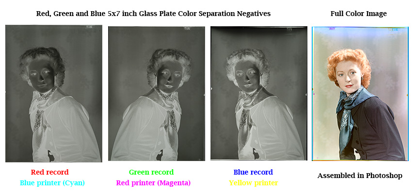
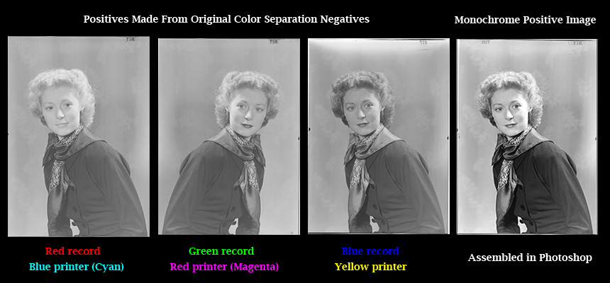
The color portrait that appears below was made by assembling the three color separation negatives in Photoshop. This is a relatively easy process, infinitely simpler than making an analog assembly print. If the NY Daily News had made a color print from these negatives, an assembly process such as Carbro or perhaps Kodak Dye Transfer would have been used.
Orientation of the Negatives
Notice the obvious: that the subject is not oriented the same way in all
three negatives. In this set of negatives the image in the green record is
reversed. When I photographed these negatives the emulsion side
of each faced my camera so shouldn't the orientation be identical? The following
is an explanation of why not.
The three plates could have been exposed with either a two-mirror one-shot, or a single-mirror bi-pack one-shot camera. In a repeating back camera all three images are laterally identical because their emulsions face the same direction — toward the lens. When a one-shot camera is used, one of the images will be laterally reversed from the other two.
A bipack camera uses a single mirror to expose three plates. A bipack consists of two plates that are in contact with each other; their emulsions touch. The third plate is alone and its emulsion faces the lens. The reversed image will be on one of the plates in the bipack.
A two mirror one-shot camera divides and directs the image formed by the lens in three directions. Approximately one third of the light is reflected to one side by a semi-transparent mirror. That light passes through a colored filter, either red, green or blue depending upon the camera design, and a black and white film or glass plate is exposed. Two thirds of the light passes through this mirror and strikes a second semi-transparent mirror. In this case, one half of the light is reflected to one side, passes through a colored filter and makes another exposure. Lastly, the remaining light passes through the second mirror, a colored filter, the green filter in this case, and makes the third exposure. Light traveling along the red and blue paths is reflected once off a mirror. Light traveling to the green record is not reflected; it passes straight through two mirrors. A reflected image will be laterally reversed from one that is not reflected.
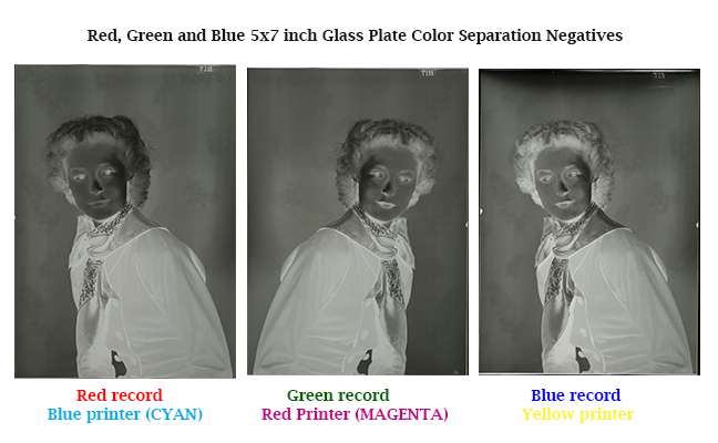
Terminology
The three images are called separations because each plate is
exposed through a colored filter that passes one third of the spectrum. The
filters separate the colors of the subject. There were exceptions,
but typically all three plates would be coated with a panchromatic black and white
emulsion. A panchromatic emulsion is sensitive to
the full spectrum but images do not exhibit color; the subject is recorded in
grayscale. Each plate records a monochrome version
of what the filters allow to pass. The red filter blocks green and
blue light; the green filter blocks red and blue, and the blue filter
blocks red and green.
Separations are also known as records. When speaking about separations, the term that's more commonly used is printer. For example, the red record is also known as the blue printer. This is simply a matter of viewpoint. A record is what the camera records, a printer is what will be used to create a full color print. Both terms refer to the same set of negatives. This is a simple concept to grasp. But why is a red record called a blue printer? Why use two different colors to describe the same negative? The answer is that separation images are recorded using the additive primary colors while printing processes use their complements, the subtractive primaries. The additive primaries are red, green and blue. Their complements are cyan, magenta and yellow.
A real source of confusion arises from the terminology used to describe printing colors. The three color separation printers are named red, blue and yellow. This is because the subtractive printing colorants, whether they are inks, dyes or pigments, have historically been and most likely always will be known by these names. The hues however are more accurately described as cyan, which is blue green; magenta, which is blue red, and yellow. In the field of four-color printing these colors appear in the abbreviation CMYK, where C = cyan, M = magenta, Y = yellow and K = key.
So we see that the red record is also commonly known as the blue printer, and that printer blue is more precisely described as cyan. Thus we could say the red record is the cyan printer, the green record is the magenta printer and the blue record is the yellow printer. I found that once I firmly grasped this twist in three-color terminology my ability to read separations and my understanding of three-color processes improved significantly.
Reading the Negatives
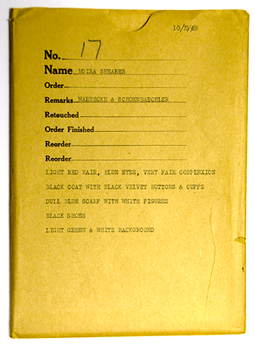
Above is a photo of the
original envelope that was used to store the set of separation negatives. The
envelope is annotated with a description of the subject's colors. Without
such a guide it is difficult to make a proper print from a separation set,
especially since a gray scale was not included in the scene. Absent a gray
scale and absent a description, one cannot know the precise coloration of the
original subject.
Scroll up the page and look over the negatives. Compare each to the assembled color image. Notice how colors are recorded differently in each record. Ms. Shearer is wearing red lipstick. The negative exposed through the red filter should record reds and hues containing red. It should be blind to greens and blues. We can see greater density in the red negative where it has recorded her red lips than in the green and blue records. More light from her red lips reached the red record because the red filter passes red light. The green and blue filters block red so this area of the corresponding negatives received less light.
Looking at her black coat we can see the silver density in each record is approximately the same. A pure black does not reflect light, so neither red, green nor blue will be recorded. In gray areas, for example where light has caused her coat to appear a neutral shade of gray, red, green and blue will be recorded in equal amounts. The density of silver that is present in the negatives will determine the shade of gray and the depth of black in the assembled full-color image.
Ms. Shearer's beautiful red hair was described as light red by the photographers. Her hair is lighter in the blue record than in the green and red records. As these are negatives, dark areas correspond to bright light and vice versa. Her hair is darkest in the red record. Her hair is lighter in the green, but not as light as in the blue record. It's interesting that her hair is not pure white in the blue record, although it might seem that it should be. After all, why would red hair contain blue? There are a few reasons for this. The most significant is that the darker areas in the blue record correspond with the white highlights in her hair. White light is composed of equal amounts of red, green and blue, thus where there are highlights, the blue portion of the white light is captured by the blue record.
The green negative recorded nearly as much light from Ms. Shearer's hair as the red record. This is because her hair is not a pure red. Compare the red of her lipstick to the color of her hair. Her hair is a variety of hues ranging from orange to yellow with significant white highlights. Yellow light is a mixture of green and red and so is orange light, but in different proportions. So the red and green records were most affected by the light reflected from Ms. Shearer's hair. The relative densities in these three negatives, properly colored and combined, can reproduce the variety of hues present in her hair.
Back to the Future
A modern example of an additive color image is the computer
display you are using to view this page. It may be surprising to learn
that the principle behind how a computer monitor displays color
is not at all modern. The first commercially successful application of the method of
color synthesis employed by computer monitors dates all the way back to the 1907 Autochrome,
and the theory was patented in 1868 by the brilliant color theorist, inventor
and physicist, Louis Ducos du Hauron.

|
Page created January 26, 2010;
updated December, 20, 2020 |